Branding
Octoplaza

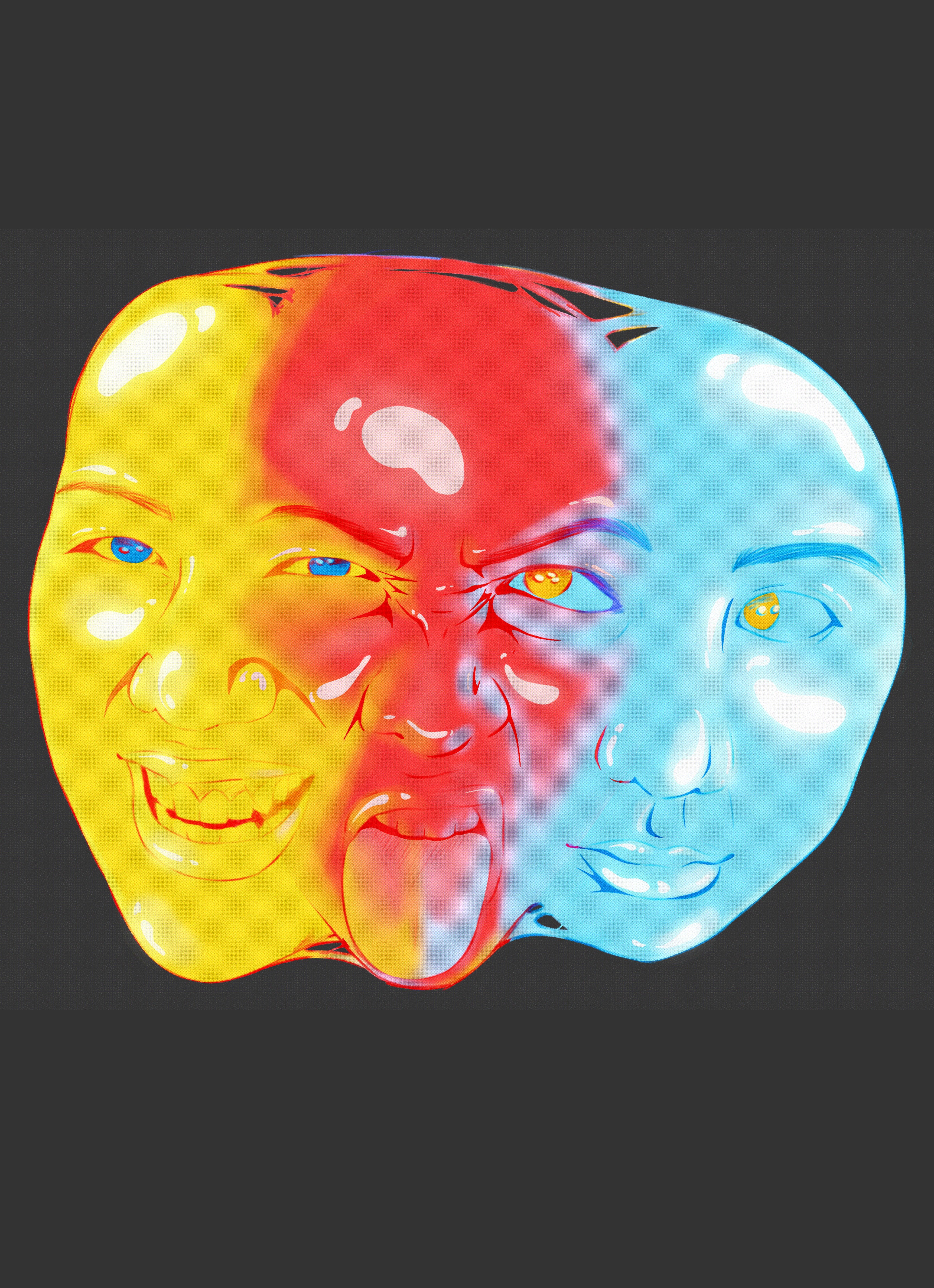
Octoplaza is designed to challenge, engage, and educate a teenage audience.
This project was created for the BCP council to be an intervention at their annual Arts by the Sea festival.
This project uses aspects of an octopus to inform design and activities, aimed to teach a teenage audience about nature in Bournemouth in an engaging way.

The black slanted rectangles are designed to mimic the look and feel of police tape. Paired with the block-printed ink style, and provocative wording, they aim to challenge our target audience to engage with our intervention.


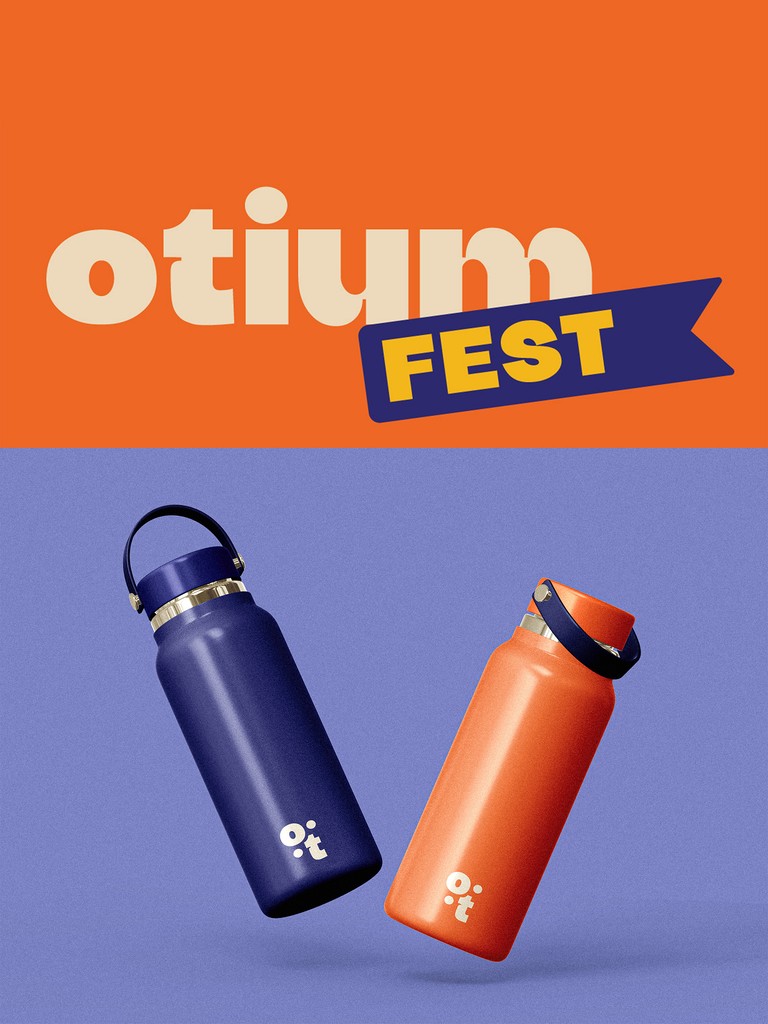
To ensure I had an easy to view colour palette I put my palette into adobe colour to check if it would be user friendly.
For this first iteration of my portfolio, I used mostly pinks and included the Kanji for my name as my logo. However, I felt this didn't represent me as I intended, so I coded another website using this code as a base.

While I felt this website better suited me, I noticed I was only using blues in my design, with no pinks at all.
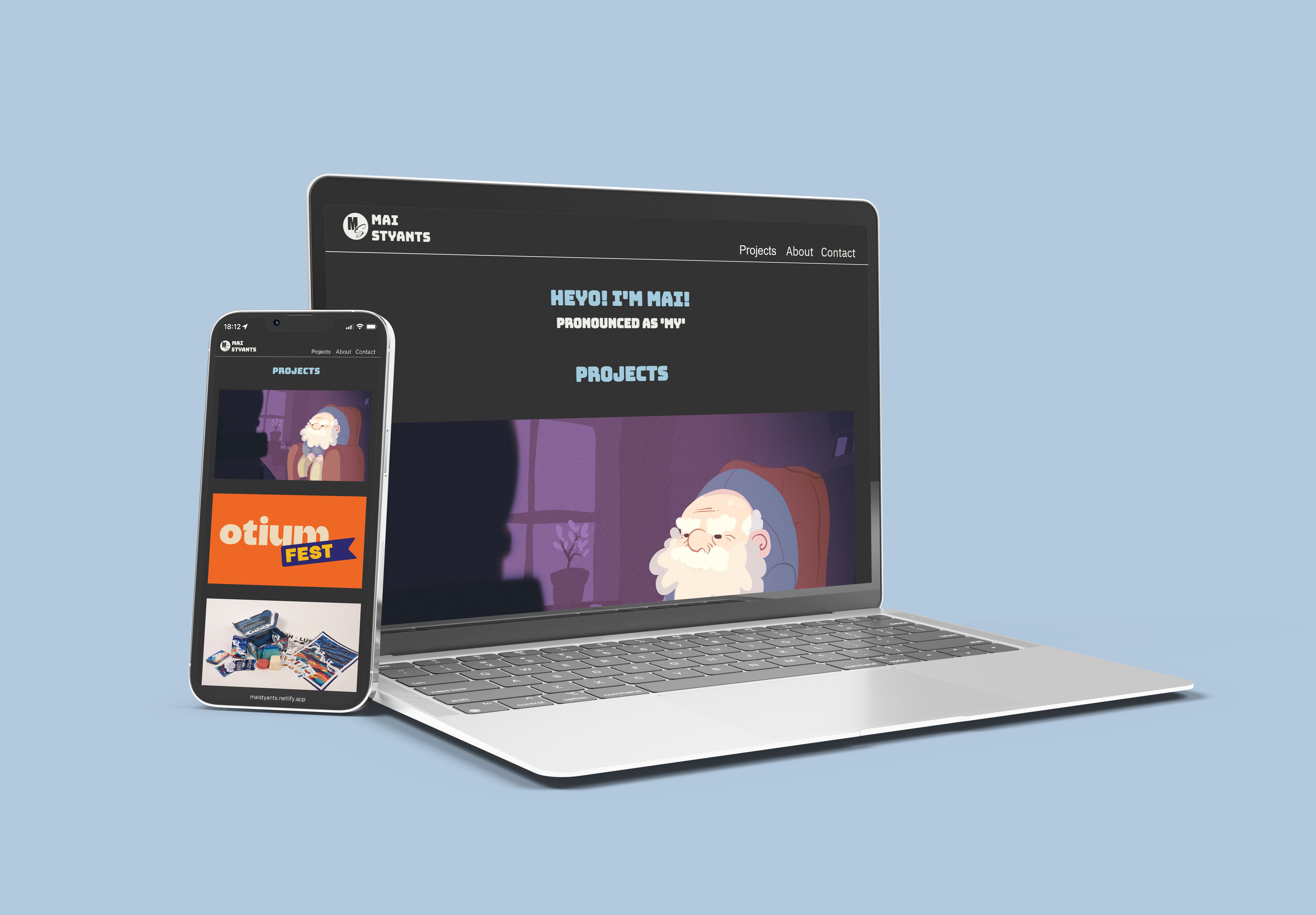
So, I decided to create this portfolio that you are currently viewing. Instead of coding it myself, I chose to apply the ideas I had learned from this project, along with a similar colour palette, to craft something I felt would better represent me.

I simplified the colour palette, retaining the colours I like and making them much brighter and more prominent.
While the coding is useful and interesting - having previously done this in a computer science class - using only CSS and HTML for a portfolio can be challenging, especially when aiming to include special animations and user interactions.