Branding
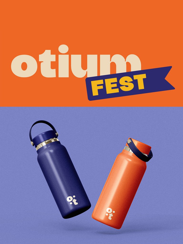
Otium
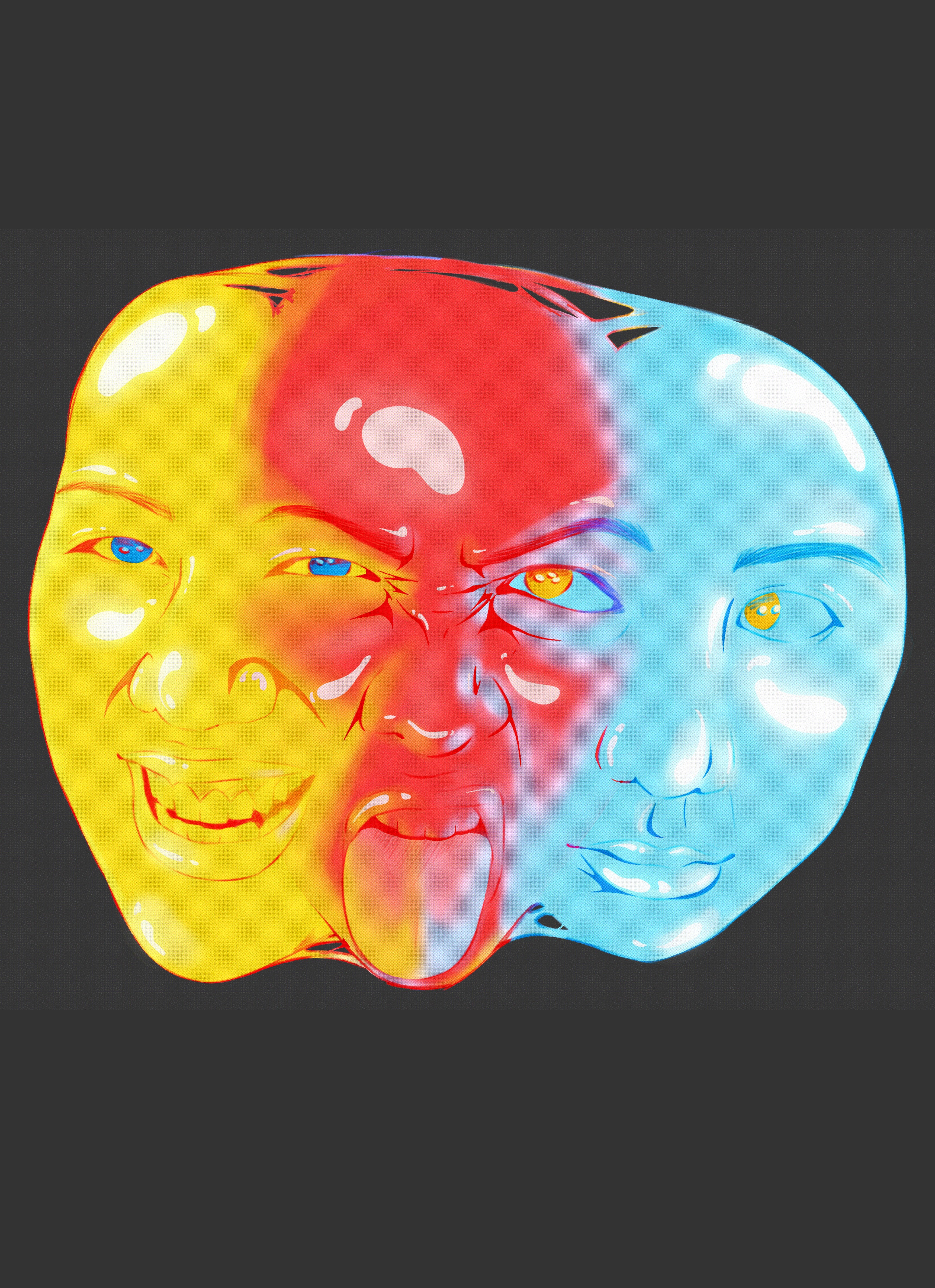
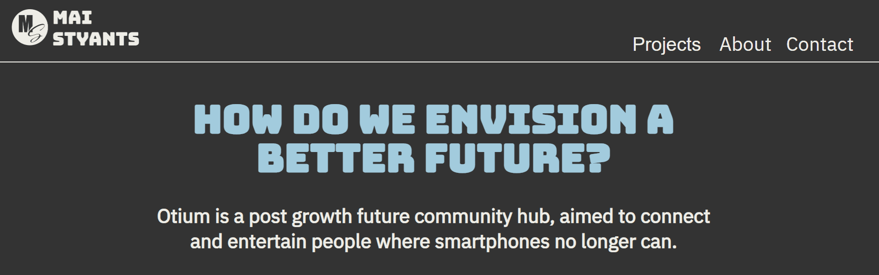
Imagining a world without fossil fuels, I was asked to reconsider my assigned object, a smartphone, and imagine a society that has moved beyond the current economic growth paradigm towards a more desirable future, informed by the principles of post-growth.
My team and I created a trio of hubs dedicated to using free time in a more productive way, each hub would either be dedicated to learning, community or wellbeing, surrounded by lush forests with opportunities for hiking and gardening.

We decided to hold a festival for our hub as a brand experience, providing an annual event for people to enjoy and look forward to.


To ensure I had an easy to view colour palette I put my palette into adobe colour to check if it would be user friendly.
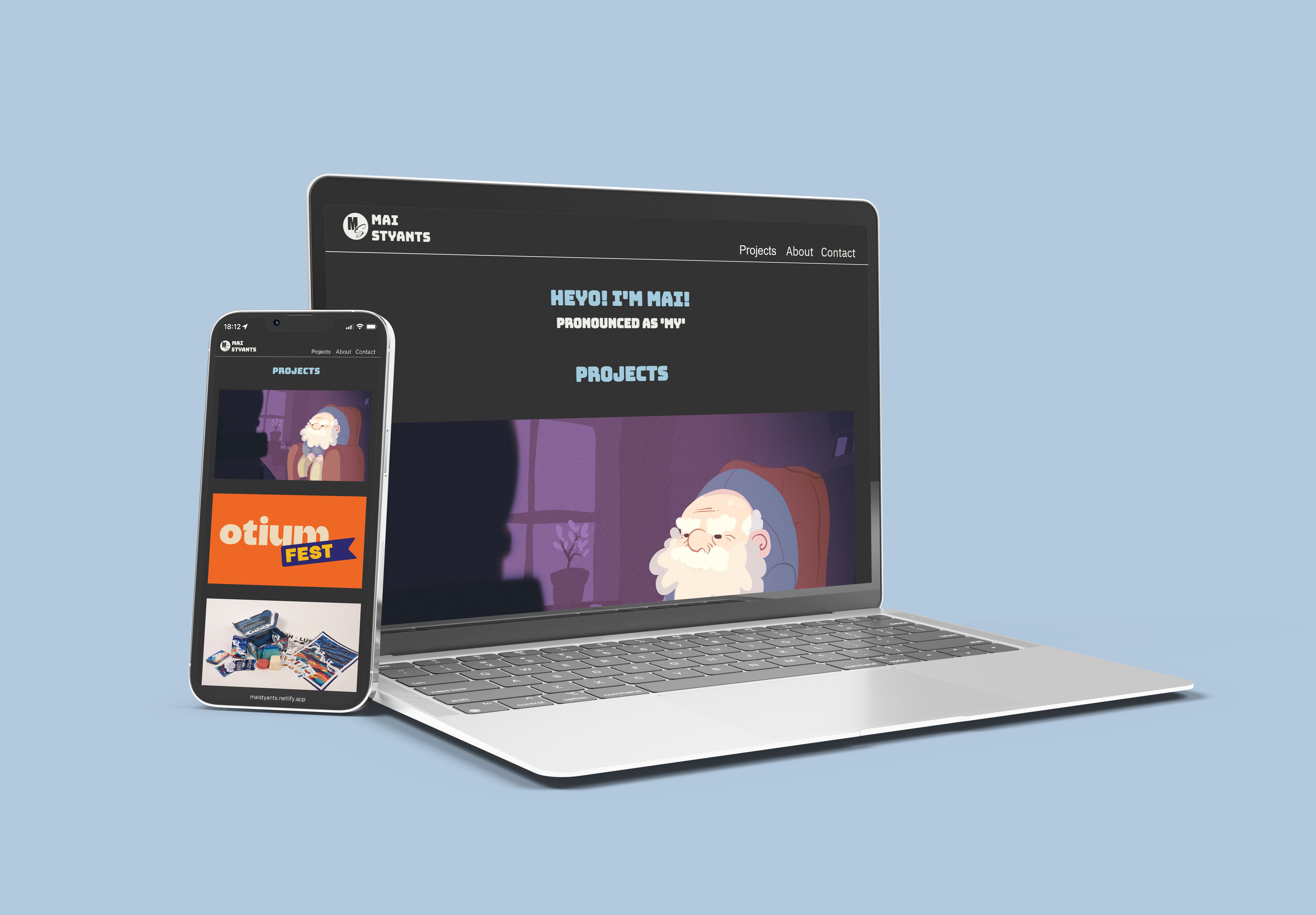
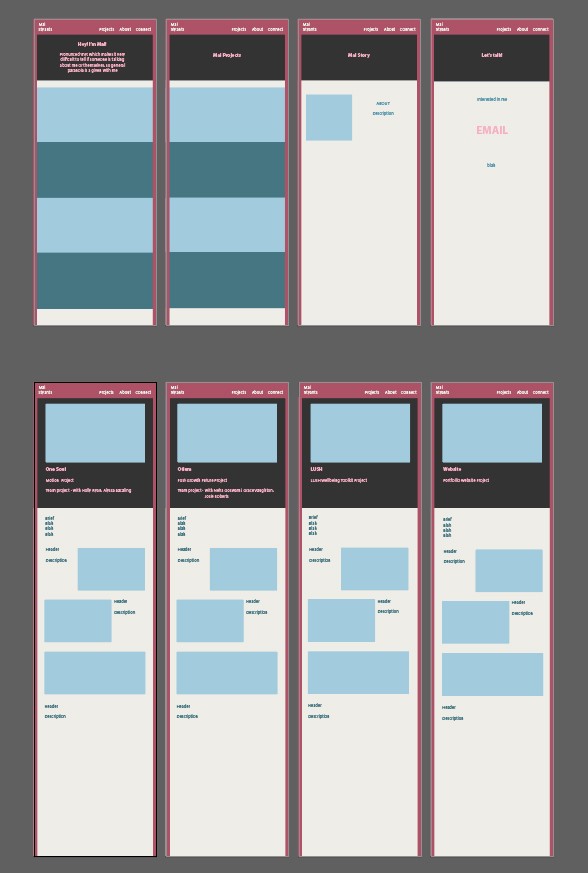
For this first iteration of my portfolio, I used mostly pinks and included the Kanji for my name as my logo. However, I felt this didn't represent me as I intended, so I coded another website using this code as a base.

While I felt this website better suited me, I noticed I was only using blues in my design, with no pinks at all.
So, I decided to create this portfolio that you are currently viewing. Instead of coding it myself, I chose to apply the ideas I had learned from this project, along with a similar colour palette, to craft something I felt would better represent me.

I simplified the colour palette, retaining the colours I like and making them much brighter and more prominent.
While the coding is useful and interesting - having previously done this in a computer science class - using only CSS and HTML for a portfolio can be challenging, especially when aiming to include special animations and user interactions.