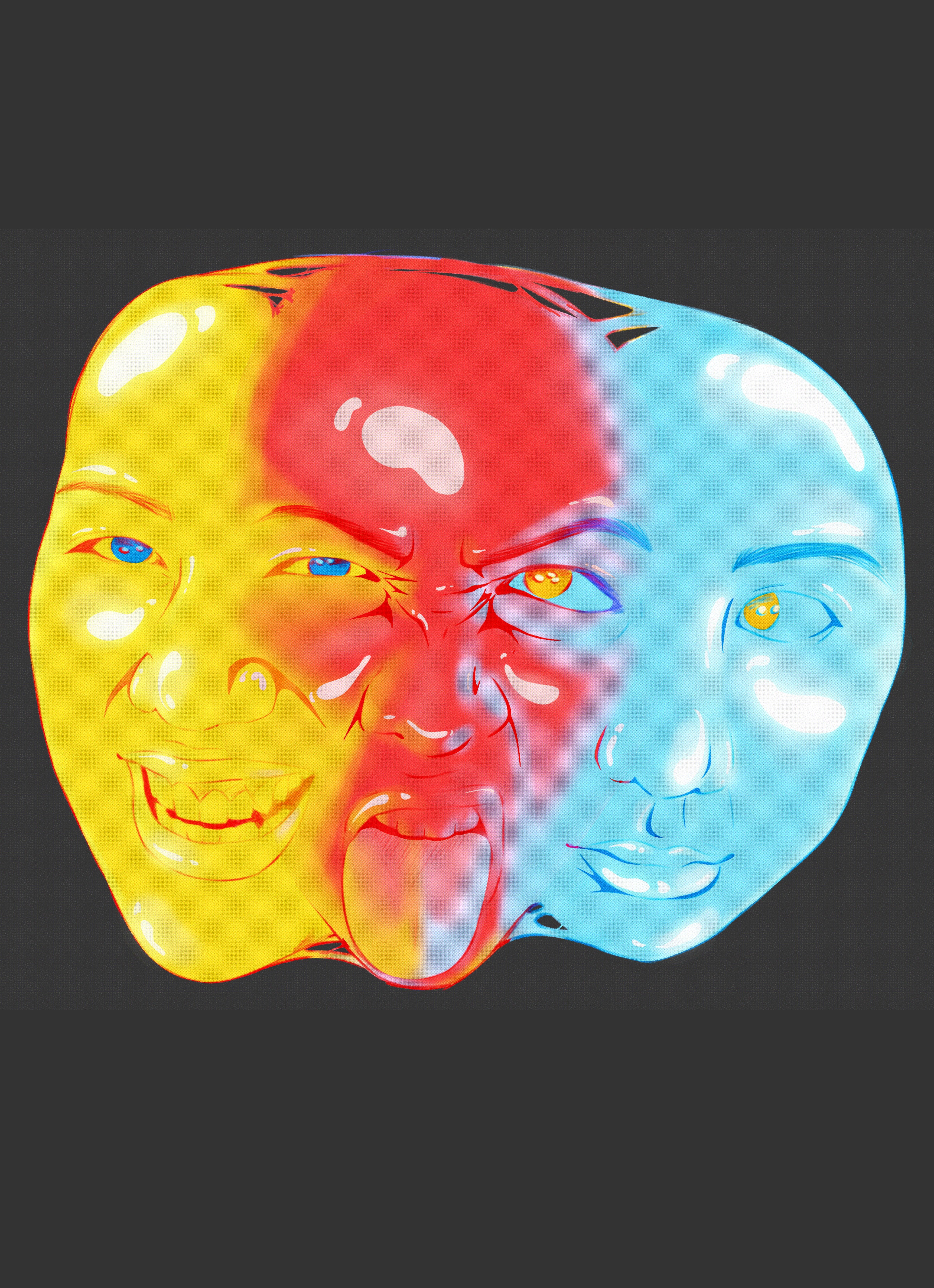
Motion
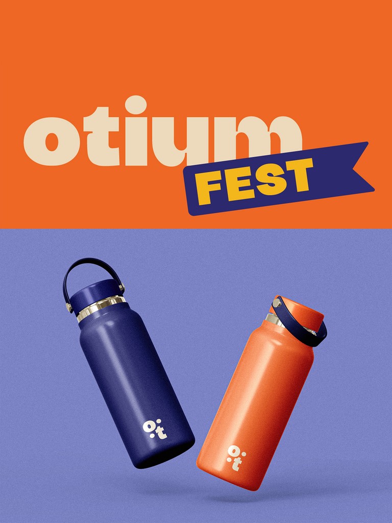
Seegull

This motion sequence is for social media, designed to raise awareness for the AUB student magazine fundraiser. It maintains the team's branding choices and targets the AUB community.

While I enjoyed my initial ideas, I had to consider the time constraints for completing this project solo. Given my two-day deadline, I decided to focus on the typography aspects of my ideas and created a sequence using those elements instead.


To ensure I had an easy to view colour palette I put my palette into adobe colour to check if it would be user friendly.
For this first iteration of my portfolio, I used mostly pinks and included the Kanji for my name as my logo. However, I felt this didn't represent me as I intended, so I coded another website using this code as a base.

While I felt this website better suited me, I noticed I was only using blues in my design, with no pinks at all.
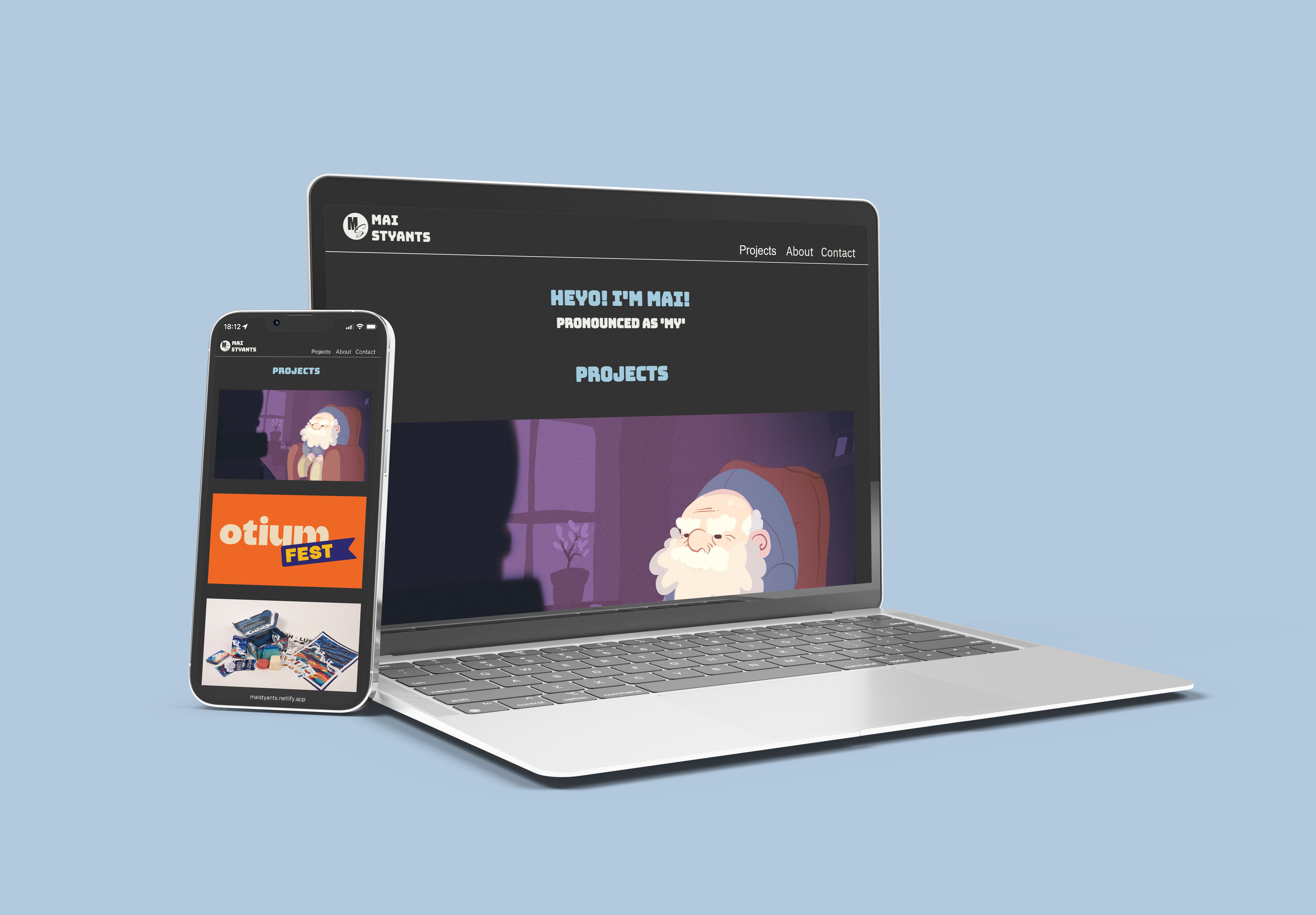
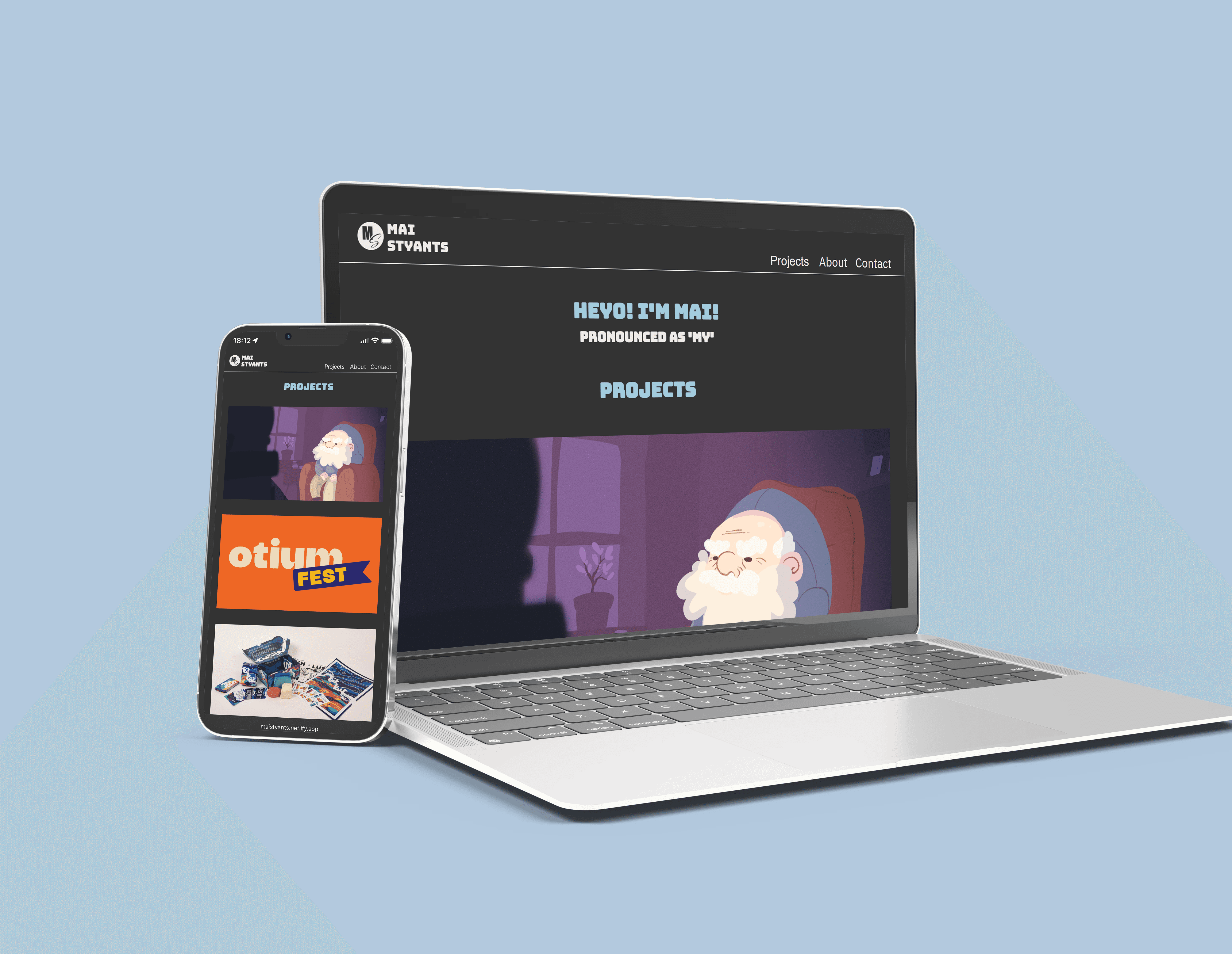
So, I decided to create this portfolio that you are currently viewing. Instead of coding it myself, I chose to apply the ideas I had learned from this project, along with a similar colour palette, to craft something I felt would better represent me.

I simplified the colour palette, retaining the colours I like and making them much brighter and more prominent.
While the coding is useful and interesting - having previously done this in a computer science class - using only CSS and HTML for a portfolio can be challenging, especially when aiming to include special animations and user interactions.